Fiverr Buyer Experience
I took a close look at how Fiverr's buyer side works, found where it breaks down, and designed a better way through.
What was wrong
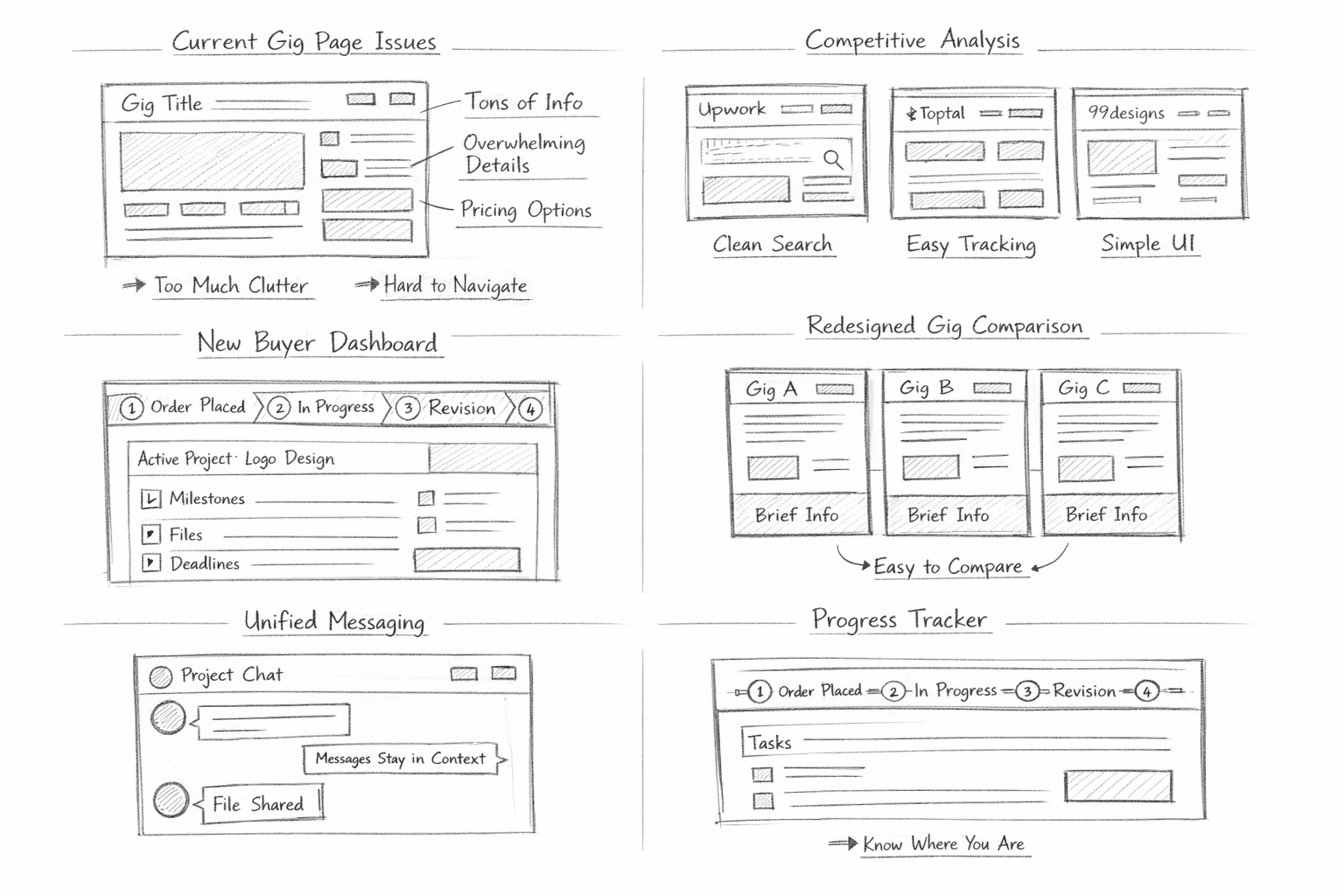
Fiverr is huge, but honestly? The buyer experience felt stuck in the past. The interface tried to serve both buyers and sellers at the same time, and neither side got what they needed. Gig pages were overloaded with information, project management after purchase was confusing, and it was hard to tell where you were in the process.
As someone who's hired on the platform, I kept running into the same frustrations. So I decided to properly document what was broken and sketch out something better.
What I did
I ran a full heuristic evaluation using Nielsen's 10 usability principles, focusing specifically on the buyer journey from the moment you search for a service to the point where you're managing an active project. I also looked at how Upwork, Toptal, and 99designs handle similar flows to see what works elsewhere.

How I got there
- Walked through the complete buyer journey end to end, documenting every friction point
- Scored each screen against Nielsen's heuristics to find systematic issues
- Compared how competitor platforms handle search, comparison, and project tracking
- Sketched wireframes for a dedicated buyer dashboard with clear project stages
- Redesigned the gig comparison view to reduce cognitive overload
- Proposed a unified messaging experience that keeps project context visible
What I found
The biggest issue was information architecture. Buyers were drowning in details on gig pages, then left in the dark once they actually placed an order. There was no clear sense of "where am I in this process?" My redesign introduced a buyer dashboard with visual progress stages, simplified gig cards for easier comparison, and a chat experience that doesn't lose context when you switch between conversations.