Buying an instrument online is hard. It's not like ordering a t-shirt.
People want to know exactly how it sounds, how it feels, what other players think, and how it compares to similar options. That's a lot of information to put on one page without making someone's head spin.
The challenge was finding the sweet spot: give buyers everything they need to feel confident, but keep the experience clean enough that they actually want to hit "buy."
Information overload was killing conversions.
I studied how Sweetwater, Guitar Center, and Thomann handle their product pages and found a consistent pattern: the more information crammed onto the page, the less confident buyers felt. The cognitive overload led people to abandon rather than commit.
- Product pages showing everything at once — specs, reviews, related items, bundles
- No clear visual hierarchy to guide the eye toward a decision
- Comparison was clunky or non-existent between similar instruments
- Checkout flows with too many steps and unnecessary form fields
Competitive research, progressive disclosure, user testing.
Competitive analysis
Studied Sweetwater, Guitar Center, and Thomann to understand how leading instrument retailers handle product pages, comparison, and checkout.
Identify conversion killers
Found that information overload — not lack of information — was the biggest thing stopping people from buying. Less is more when organized well.
Progressive disclosure wireframes
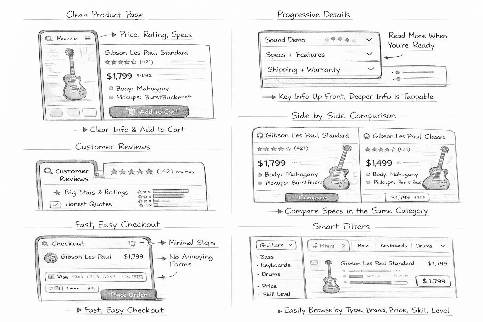
Wireframed product pages that show essentials first (price, rating, key specs) and hide deeper detail behind a tap — not a scroll to the bottom.
Usability with musicians
Ran usability tests with musicians at different experience levels and tweaked based on where they got stuck or hesitated.
Progressive disclosure as the core design principle.
Muzzic shows the essentials first — price, rating, and a few key specs — and lets people dig deeper only if they want to. The visual hierarchy is designed to naturally draw your eye to "Add to Cart" without hiding the information serious buyers need.
Side-by-side comparison for instruments in the same category, verified purchase reviews front and center, smart filters by instrument type, brand, price, and skill level. Checkout in as few steps as possible — no unnecessary forms, no friction after the decision is made.
Give buyers the confidence to buy, not more reasons to hesitate.